

- Client
- Scope
- Year
- Dear San
-
Brand Identity
Packaging
Social - 2025
-
Media by Dear San
3D Rendering by Sidepeace Agency
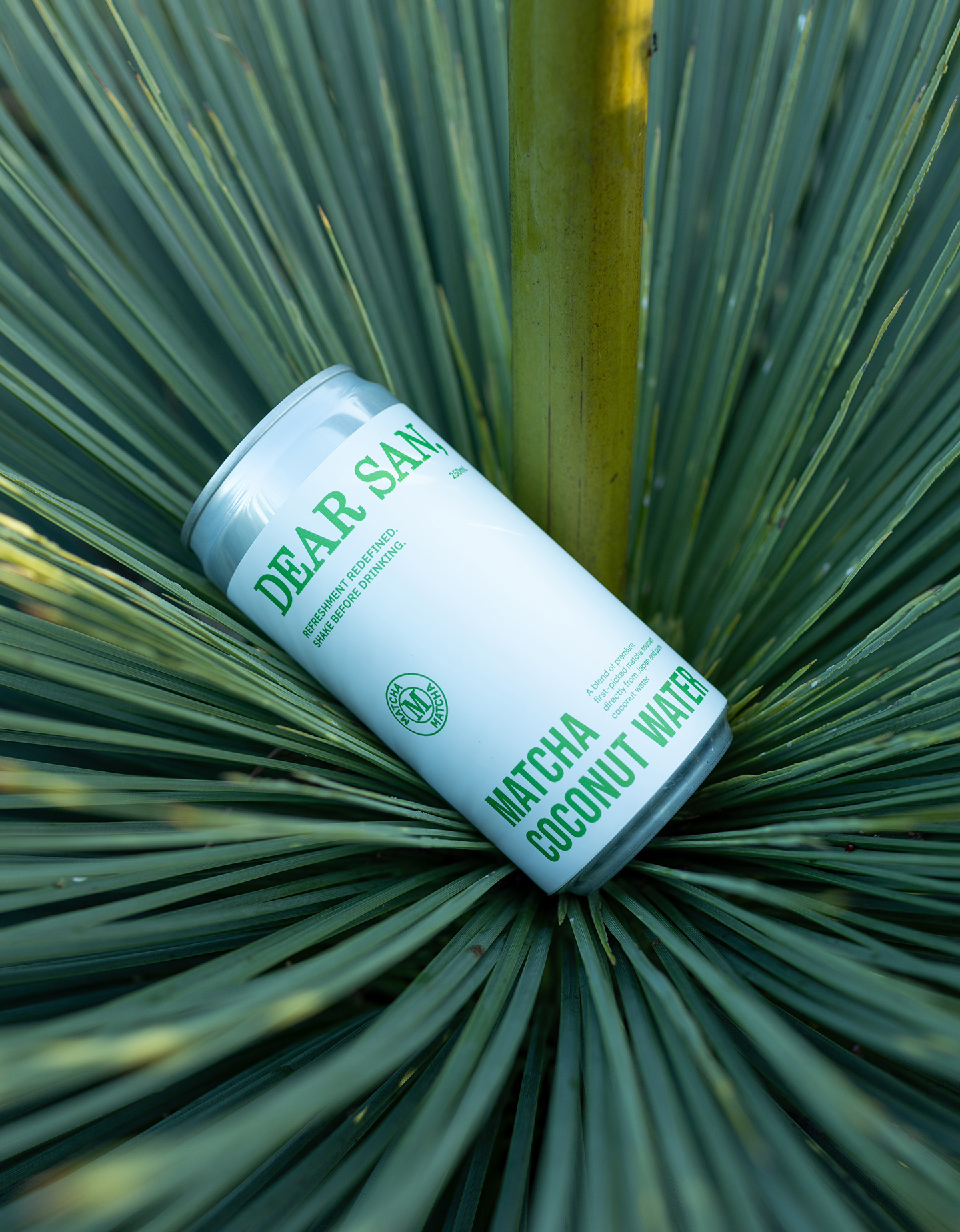
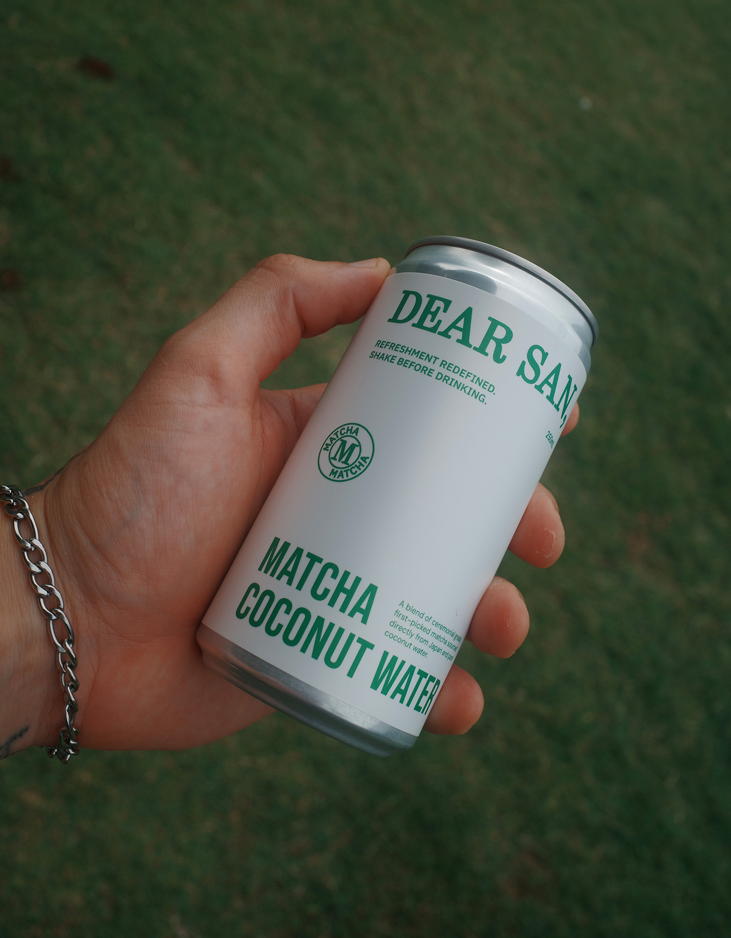
Dear San was created to fill a gap in the market for grab-and-go, dairy-free flavoured cold beverages made with high-quality, clean ingredients, including Australia’s first RTD canned matcha coconut water.
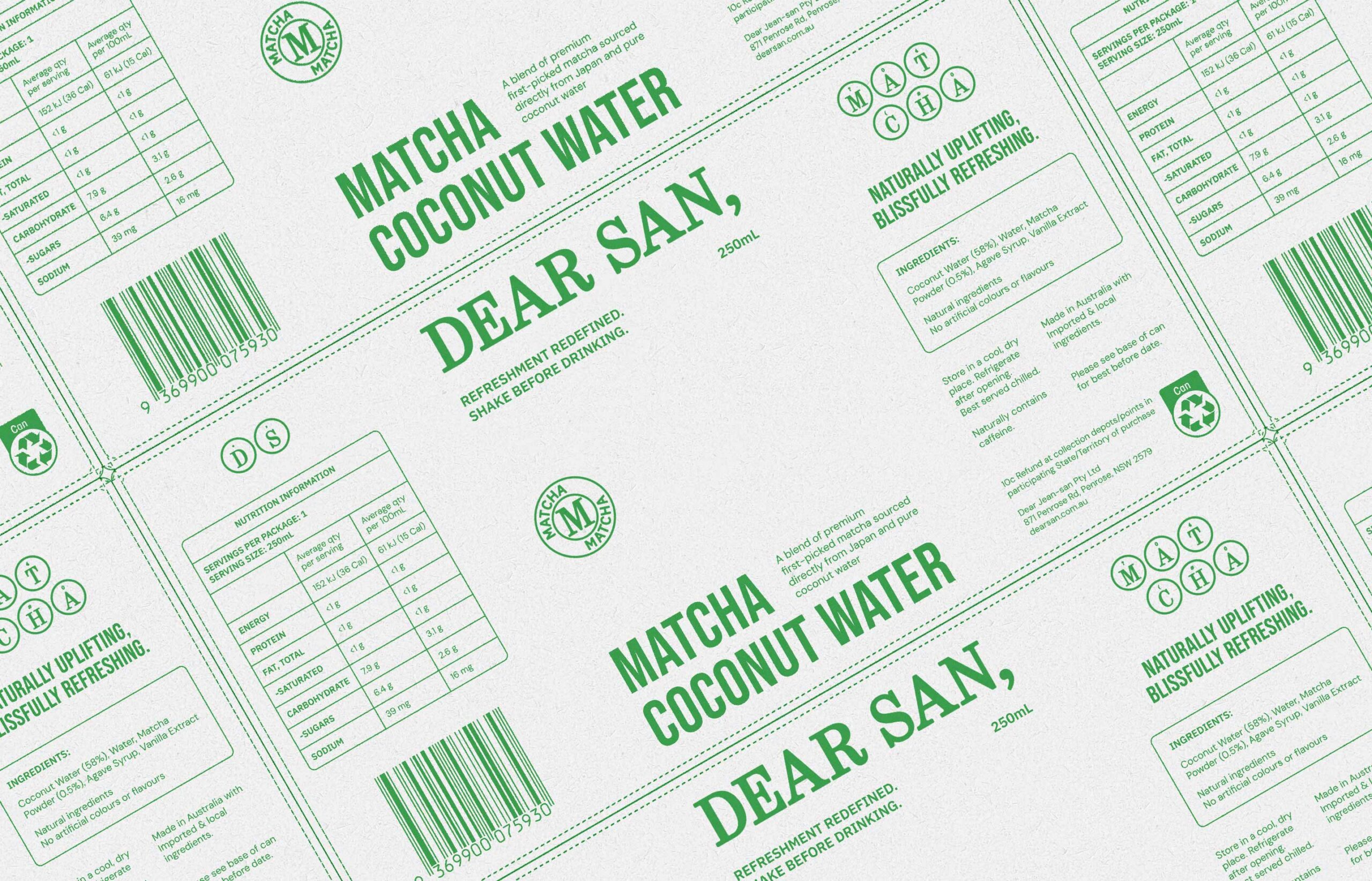
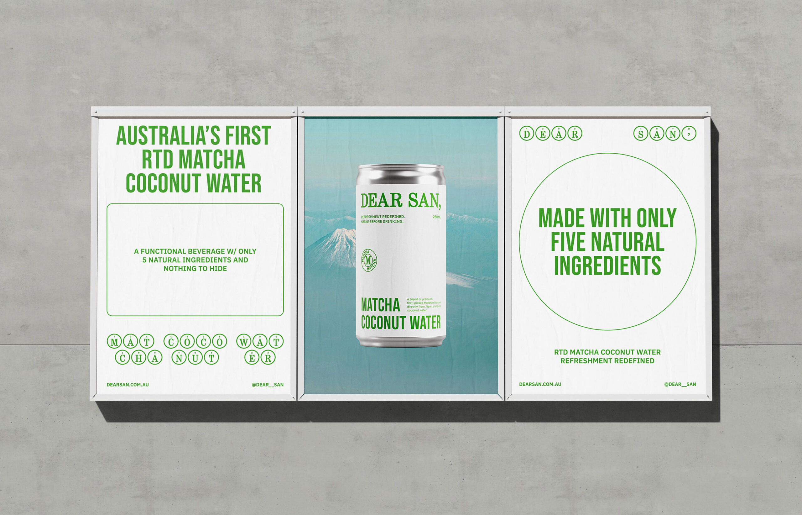
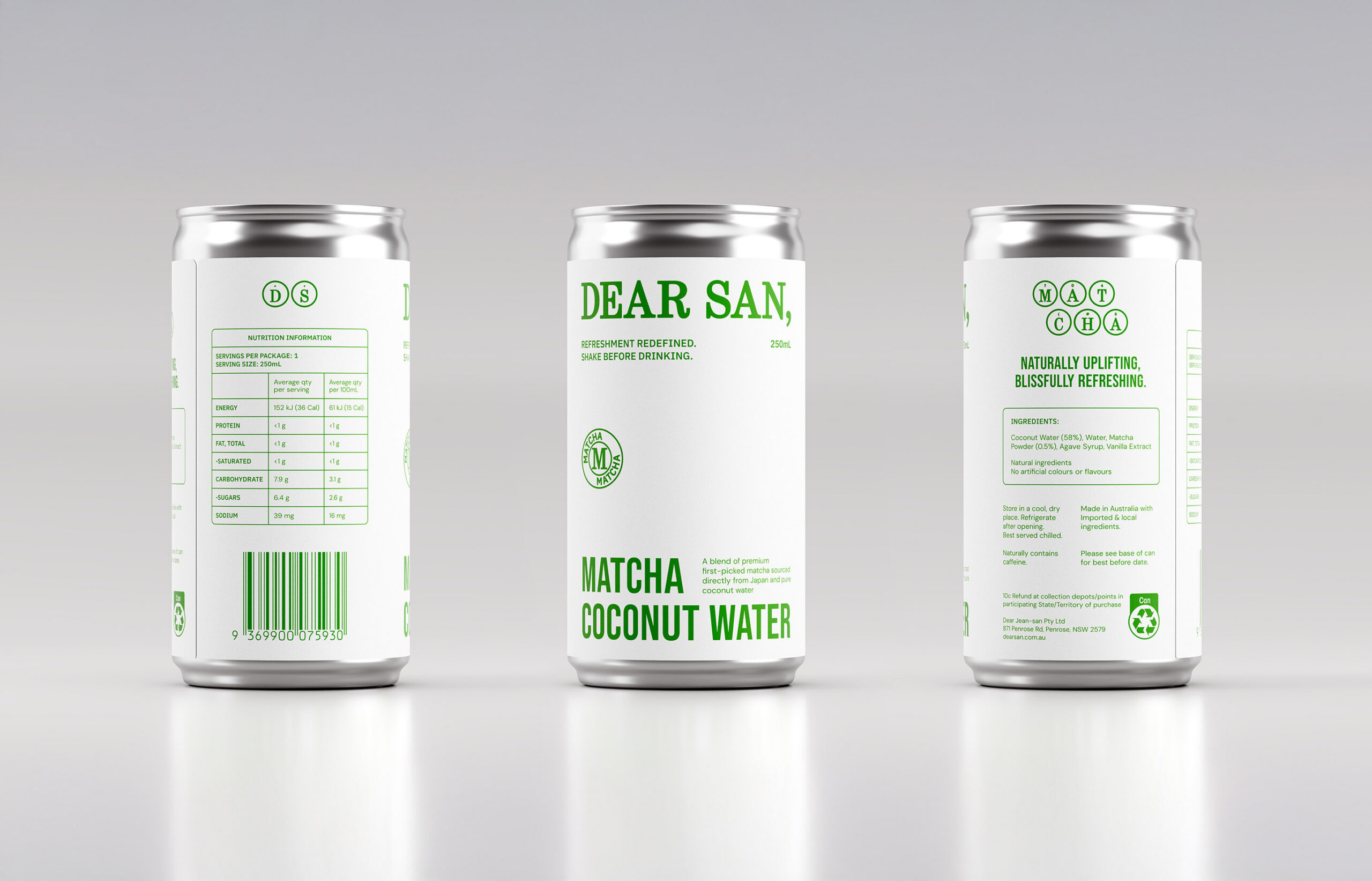
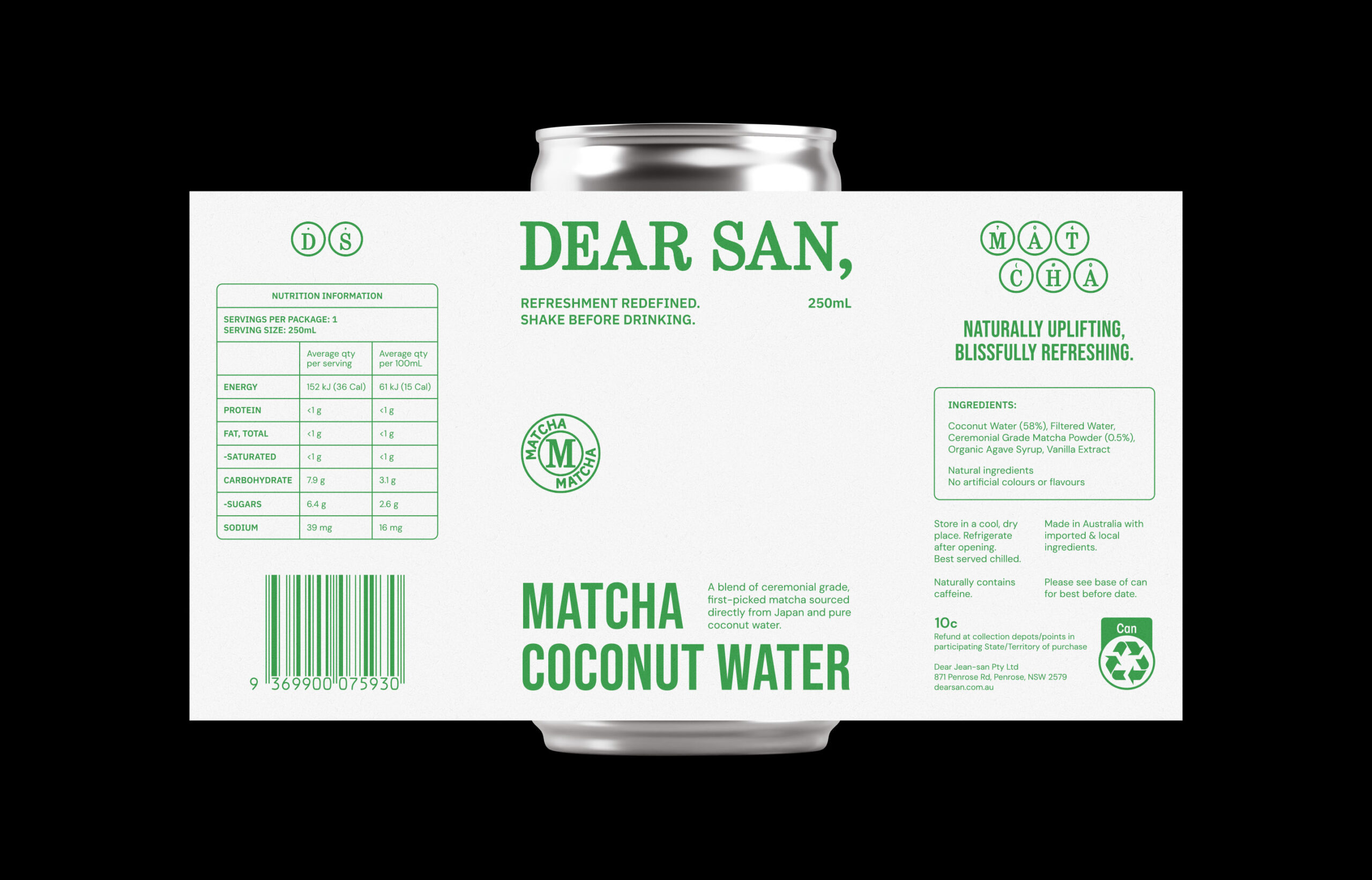
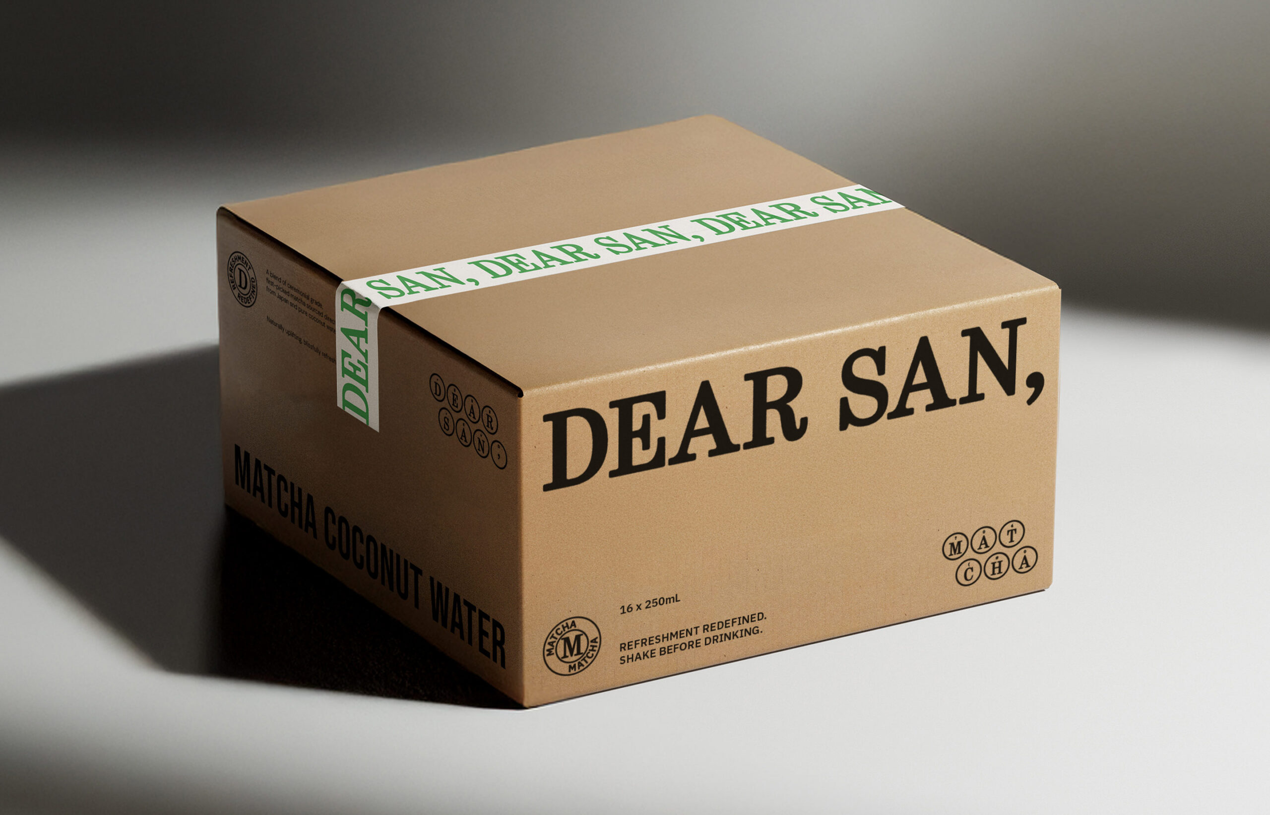
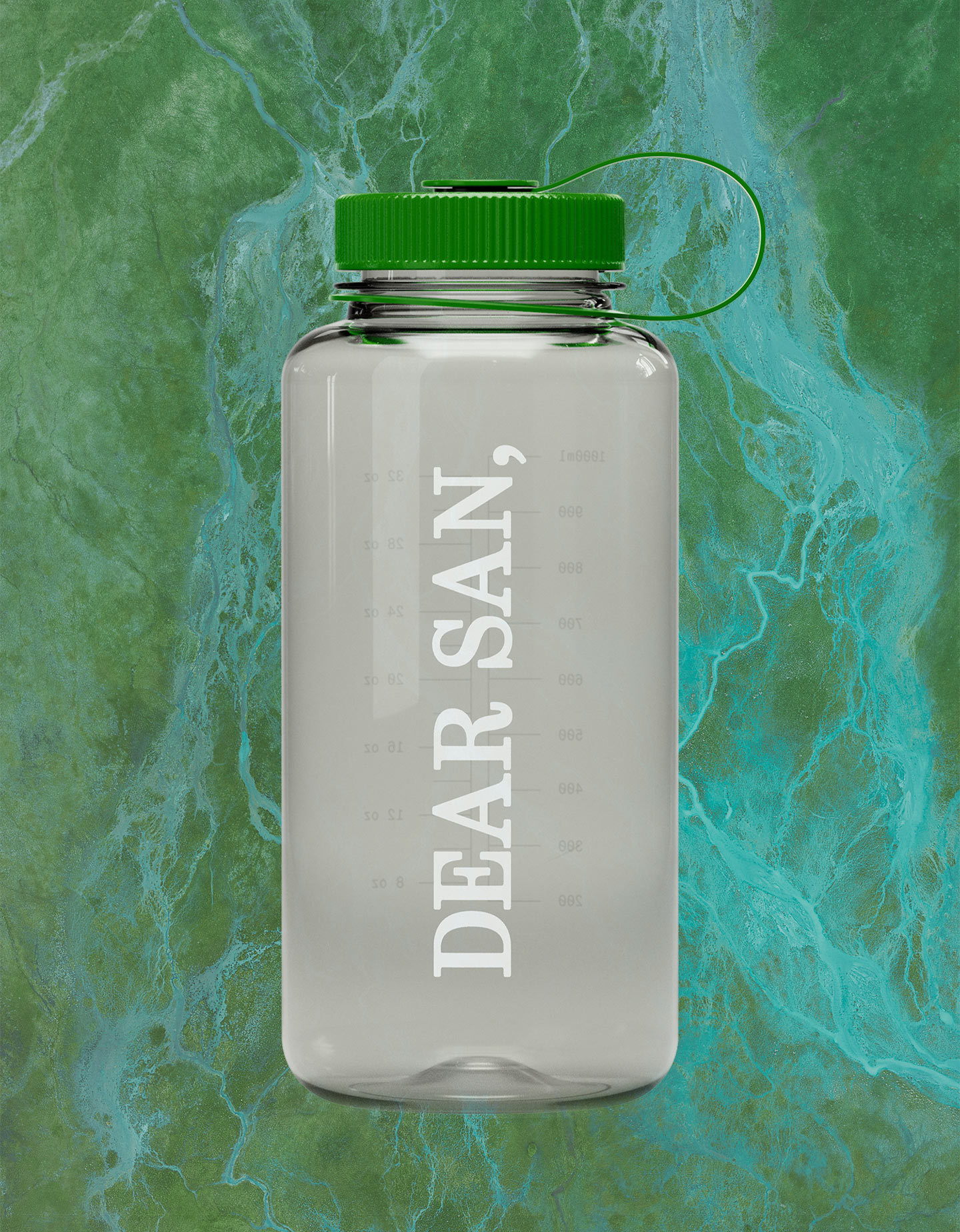
We were engaged to develop the brand identity, packaging design, and brand templates. The concept centres on intimate letter writing and the idea of a typewriter, a clear reference to the name “Dear San”. This is expressed through structured serif typography, subtle ink-like textures, and a considered grid system across layouts and imagery.
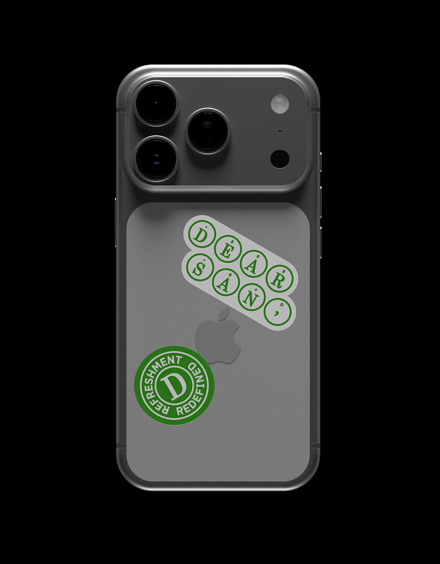
Circular motifs referencing typewriter keys frame logos and flavour names, alongside stamp-like brand elements. The packaging extends this approach through a spacious, typography-led system.
Dear San, refreshment redefined.